Understand The Data You Use for Investing (Part 2)
In my last post I demonstrated the importance of understanding how data is presented when comparing the performance of different investments. When utilizing a cumulative performance chart, the key takeaway was that the starting point has a significant impact on the perceived results. In our example, we compared the Dow Jones Total Stock Market US Index with the Dow Jones Global Index starting in 1994:
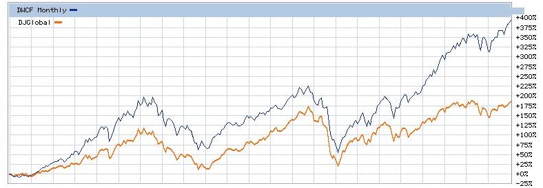
It is clear from the chart that 1994 would have been a good year (in hindsight) to have invested all your money in U.S. stocks. But despite the significant outperformance of U.S. stocks over international stocks over the 23-year period shown, one should not leap to the conclusion that the same would have been true for any other year. For example, the chart below is identical to the one above, but this time starting in 2002 instead of 1994.
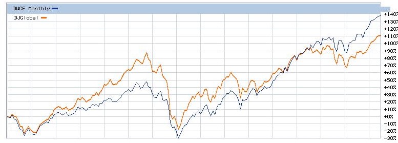
Notice anything different? In this chart the international stock fund (in orange) outperforms the U.S. stock fund through the middle of 2013. Stated comparatively to the previous chart, 2002 would have been a better year to have invested all your capital in that international fund. If you had sold it any time prior to 2013, you would have made more money than if you had invested in U.S. stocks.
Why do these charts look so different? It’s because cumulative performance tends to mask the individual monthly or yearly performance of the different investments. Over the past 20 years, for example, U.S. stocks outperformed international stocks only 11 times on a yearly basis. That’s barely more than half the time. But you can’t tell than from the chart above.
Is there a better way to compare investments? You could look at annual returns rather than cumulative returns. The chart below shows the return each year of the broad equity markets of 21 developed countries for the period 1997 – 2016. The country with the highest return is at the top, and the one with the lowest is at the bottom.
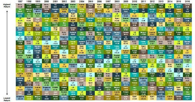
What is most apparent from this mosaic is that no country consistently had the best performance year after year. Finland topped the chart the most number of times (four), and the only country that managed to even stay in the top five consistently was Austria (from 2001 – 2005). The U.S. in particular was number one only once, in 2014.
The original purpose of this exercise had been to determine if it would be better to invest in U.S. stocks or in international stocks. What we’ve learned from this analysis is that 1994 would have been better for U.S. stocks, and 2002 (at least through 2013) favored international stocks. The country chart above provides a lot more detailed data, but the only conclusion one can draw is that no one country outperforms over time.
Which suggests a possible diversified approach. Analysts at Dimensional Fund Advisors created a hypothetical portfolio consisting of 70% US equity indices and 30% non-US indices. Here’s its cumulative performance (in green) compared to the S&P 500 (in blue) from 1970 – 2016:
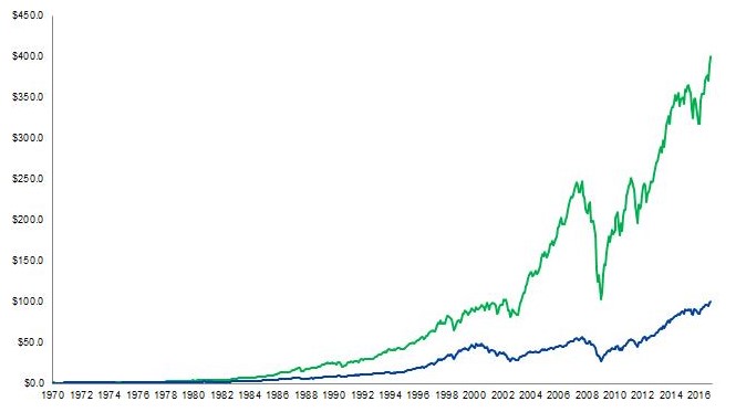
As you can see, the diversified portfolio blows away a pure U.S. stock investment based on a 1970 starting point (although with significantly more volatility). And this portfolio additionally outperformed the S&P 500 starting in 1980 and in 2000. It underperformed however starting in 1990 and again in 2010.
The main purpose of this post was to help you avoid reaching incorrect conclusions due to misinterpretation of data. Even something as simple as utilizing logarithmic vs. linear scaling of returns in charts can have a big impact on the insights we draw. And as far as the comparison of U.S. vs. international stock investing, the takeaway is that a diversified portfolio comprising both is likely to provide the best returns, but with higher volatility than a pure U.S.-based one. That’s the inevitable tradeoff between investment returns and risk.
One Response
Love it! Thanks.